Over the last two weekends in November, two Tibetan calligraphy courses led by well-known and highly skilled Tashi Mannox, and organized by the Shang Shung Institute, were held in Italy.
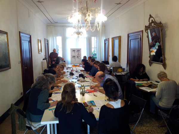
The first course took place in a beautiful stately building in the old part of Venice and was centered on learning the classical Uchen characters, that is the font ‘with the head’.
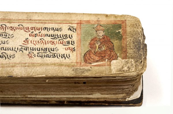
Prof. Fabian Sanders introduced the course by giving a talk on the Five Sciences. Tashi Mannox presented the history of the development of the classic Tibetan language from the 8th century up to the present time, describing how young monks traditionally used to learn the alphabet in Tibet and the main differences of calligraphy styles diffused in Tibet in the past and today.
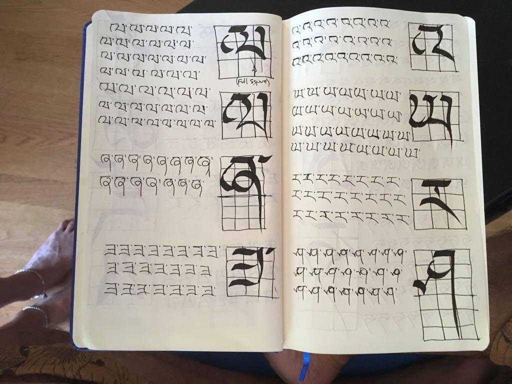
In Venice he taught the Uchen script, the calligraphy with a “head”, which is the most well-known Tibetan font, today used for printing books and in the past for wood block printing. During the course he showed students how to write the Tibetan letters within a grid according to established proportions, starting from the letter KA up to the letter A adding the vowels and the super-scribed and sub-scribed letters.
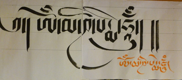
The course concluded with Tashi demonstrating how to write the main seed syllables used for meditative purposes, following which he gave a wonderful demonstration of freestyle calligraphy – diffused for the first time in the West by Chögyam Trungpa – and composed three beautiful works using a brush and sealing them with vermilion ink.
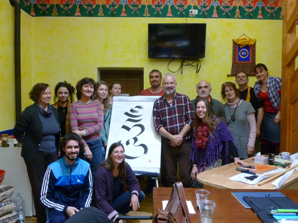
The second weekend was held against the backdrop of the lovely hills of Tuscany at Merigar West, the first Gar of the Dzogchen Community. After Tashi’s introductory talk on Friday evening, he started to teach the most common cursive style of calligraphy used by Tibetans when they write in a formal way – the tsug tung or the ‘short form’. This was the first time that he has taught this calligraphic style.
This style of calligraphy has the characteristics of having short compact letters that are balanced and made more beautiful by the use of long flowing vowel signs. Once one knows this style, one is able is read most of the other styles of Ume.
At the end of the course, Tashi wrote a wonderful Mani mantra, explaining the symbolic meaning of the colors of each individual syllable corresponding to the six realms and the six emotions. In reply to a question he gave a detailed explanation of the type of materials and tools that he uses.
Both courses were enthusiastically followed by students from all over the world such as Brazil, the USA, Romania, Germany etc. The SSI kindly thanks him for accepting the invitation to give these courses and looks forward to him returning to give more in-depth courses in the future.
Giorgio Dallorto

